Headings
H1 Heading example
H2 Heading example
H3 Heading example
H4 Heading example
H5 Heading example
H6 Heading example
Typography
This is some lead text using the text_lead modifier. Lorem ipsum dolor sit amet, consectetur adipiscing elit. Sed iaculis nisi non turpis facilisis, sit amet porta ipsum cursus.
Donec example link nec est sapien. Mauris lobortis odio lacus, eu feugiat neque finibus et. Sed tortor nulla, tristique at est non, dapibus semper libero. Quisque leo velit, blandit semper quam in, venenatis ultricies libero.
Sed pretium fermentum lacus at mattis. Phasellus at ultricies est, a mollis libero. Maecenas sapien justo, tincidunt vitae sapien ac, ornare porttitor risus. Sed id gravida justo, molestie dapibus tellus. Donec leo velit, cursus finibus finibus et, ultrices bibendum augue. Etiam vel neque blandit, mollis tortor eget, condimentum urna. Donec suscipit nisi lectus, et venenatis tellus ornare eget.
“Anarchism stands for the liberation of the human mind from the dominion of religion and liberation of the human body from the coercion of property; liberation from the shackles and restraint of government. It stands for a social order based on the free grouping of individuals…”
― Emma Goldman, Anarchism and Other Essays
Syntax Highlighting
Code can be injected inline. It looks like this: var example = true. Also, you can also inject code using the block format:
import u from './utility.js'
export default function() {
  'use strict'
  let api = {}
  api.init = (options) => {
    settings = u.extend( defaults, options || {} )
    // Component code goes here...
  }
  return api
}
You can also provide a code label using the code-label class.
Input
{{ 'Hello' | append: ', world!' }}
Output
Hello, world!
Tables
| First Header | Second Header |
|---|---|
| Content Cell | Content Cell |
| Content Cell | Content Cell |
| Content Cell | Content Cell |
| Content Cell | Content Cell |
Notices
Hello, world!
Welcome to Lost Woods, a simple but extremely powerful Jekyll theme.
Right now this is an example of the box component. It's really very simply but we need to account for when it is placed inside a type component.
This is another example of a notice container.
This is another example of a notice container.
This is another example of a notice container.
This is another example of a notice container.
<div class="notice">
  ...
</div>
<div class="notice notice_type_primary">...</div>
<div class="notice notice_type_secondary">...</div>
<div class="notice notice_type_dark">...</div>
<div class="notice notice_type_shade">...</div>
There are also symantic notice types for displaying content with specific meaning and can also optionally be made dismissible:
This is some informative content.
This is some good content! Whatever you did, it was successful.
This is some important content, warning you to be cautious.
This is some critical content. Maybe even an error.
<div class="notice notice_type_info" data-dismissible>
  <span class="notice__close" data-dismiss>...</span>
  ...
</div>
<div class="notice notice_type_success">...</div>
<div class="notice notice_type_caution">...</div>
<div class="notice notice_type_danger">...</div>
Icons
Whether you inject icons directly or using the symbol definitions method, Lost Woods comes packaged with Feather Icons. Below are a few examples in action:
| Icon | Demo |
|---|---|
arrow-up | |
arrow-right | |
arrow-down | |
arrow-left | |
menu | |
search | |
check-square | |
clipboard | |
save |
If you’re using many icons it may be worth including the symbols file using our config settings and include via: {% include icon.html icon="[id]" %}. otherwise, you can inject icons directly using {% include icons/[id].svg %}
Forms
Buttons
Button color modifiers:
<button class="button">Button</button>
<button class="button button_color_primary">Button</button>
<button class="button button_color_secondary">Button</button>
<button class="button button_color_accent">Button</button>
<button class="button button_color_shade">Button</button>
<button class="button button_color_dark">Button</button>
<button class="button button_color_subtle">Button</button>
Button size modifiers:
<button class="button button_size_sm">Button</button>
<button class="button">Button</button>
<button class="button button_size_lg">Button</button>
Button block modifiers:
<button class="button button_block">Button</button>
<button class="button button_block_xs">Button</button>
<button class="button button_block_sm">Button</button>
<button class="button button_block_md">Button</button>
<button class="button button_block_lg">Button</button>
<button class="button button_block_xl">Button</button>
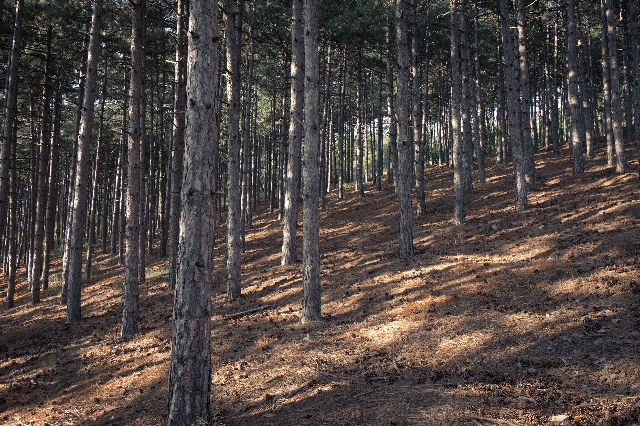
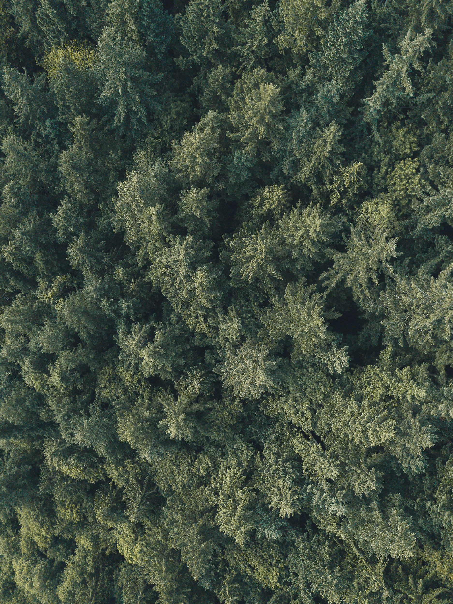
Media
Images are responsive by default. You can optionally add the .lazy class along with the data-src and data-srcset attributes to enable LazyLoad image loading.
It’s also possible to output responsive video and other media using the .embed class on a wrapping div.
For easier responsive media embeding, check out the embed include helper.
Lastly available is the .pull class that you can add to an image wrapper which will extend the media passed the content container.
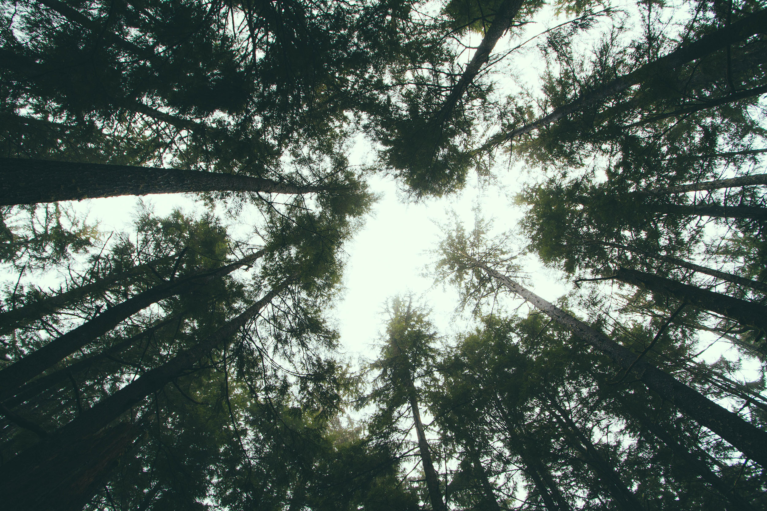
Also available are styles for figure and figcaption. Here’s an example using a few modifier classes to make this conent stand out.
For easier LazyLoad images, check out the lazyload include helper.